INDUSTRY:
Construction Software SaaS
about.
ConstructConnect is a B2B SaaS platform that empowers construction professionals to discover, track, and win commercial projects across North America. The product combines project intelligence, data insights, and collaboration tools into one ecosystem, helping users move from discovery to bid with efficiency and confidence.
As part of the product design team, I contributed to creating user-centric experiences that bridged marketing and product touchpoints, simplified complex data, and improved engagement across key workflows.
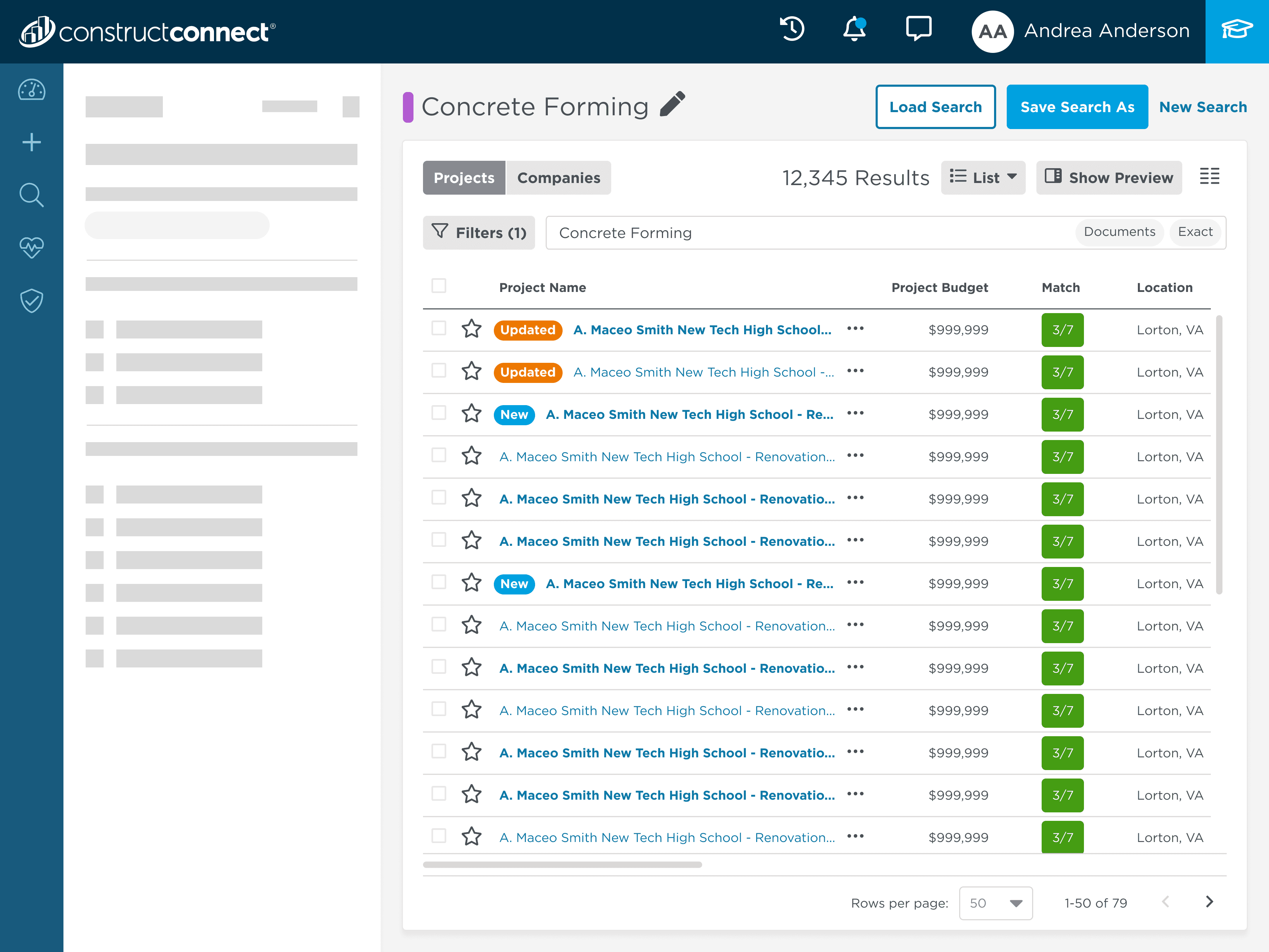
optimizing search result count placement.
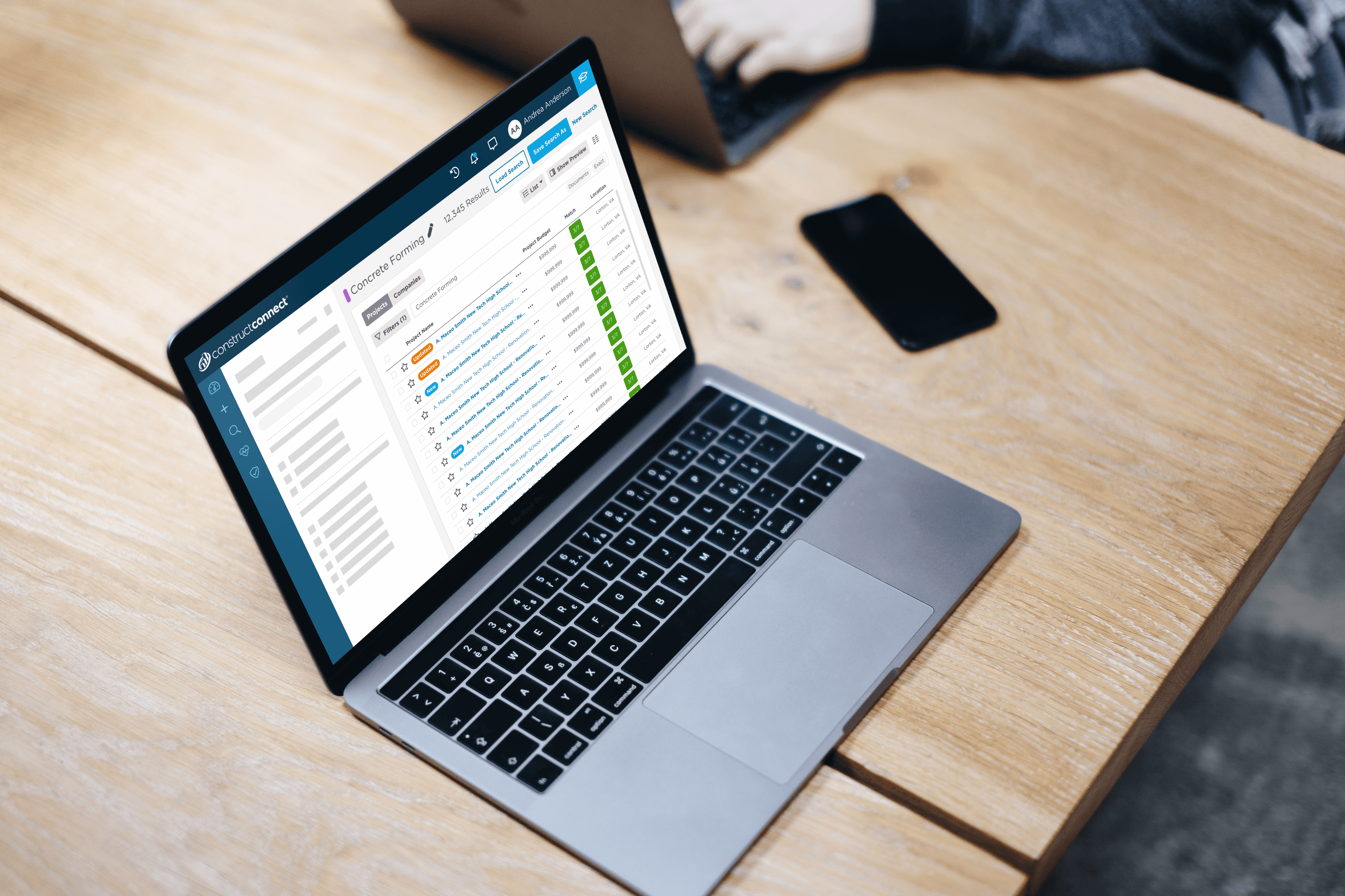
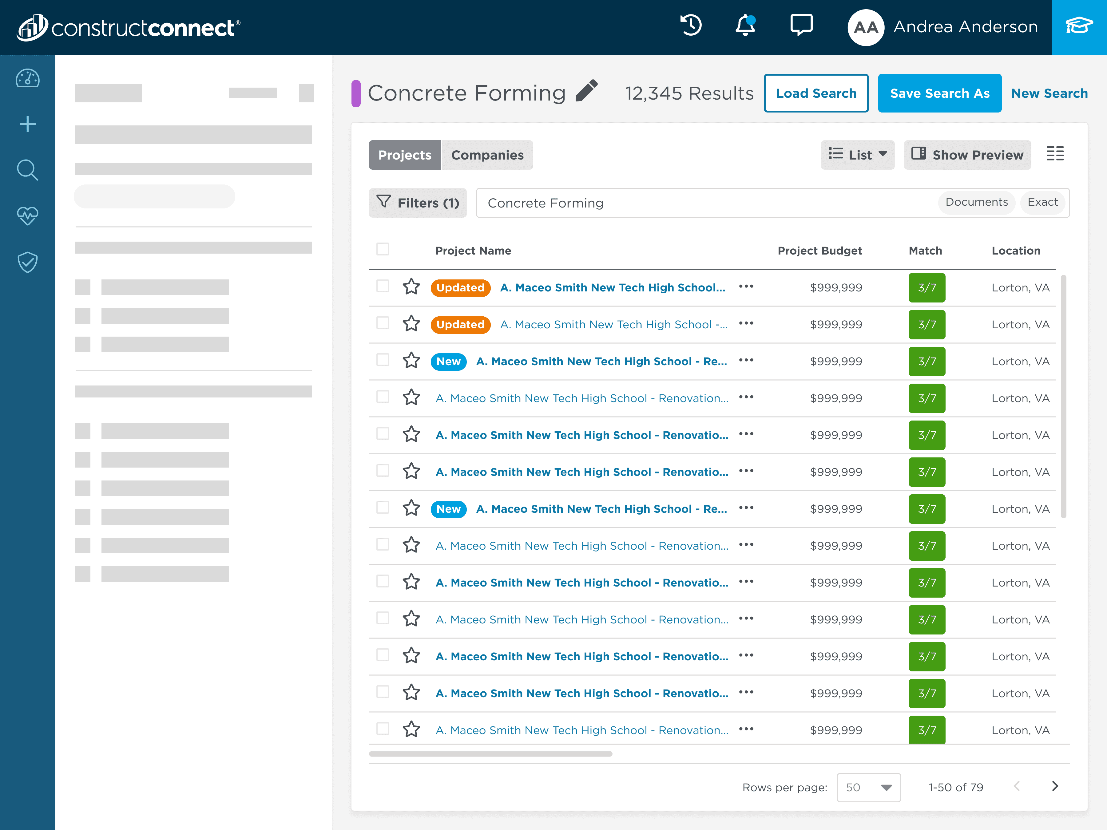
During user feedback sessions, we observed that the total number of search results was placed in a secondary position on the screen, requiring extra scanning time.
By analyzing click patterns and eye-tracking feedback, it became clear that users expected the search results count to be visible in their primary scan path. Placing the count higher in the interface aligned with natural F-pattern reading behavior, improving efficiency.
Our UX Researchers proposed repositioning the total results count to the top of the search results section, adjacent to the search title and key action buttons.
My next steps were to:
Create updated mockups in Figma for the new placement
Review placement with product managers and engineers to confirm feasibility and maintain visual hierarchy
Validate the design in internal QA sessions to ensure clarity and consistency with the design system
The impact for users:
Reduced time to scan results count by moving it into the primary viewing area
Improved usability for power users performing rapid searches
Established a precedent for prioritizing critical information in high-volume search workflows
driving traffic into the application with the daily leads email.
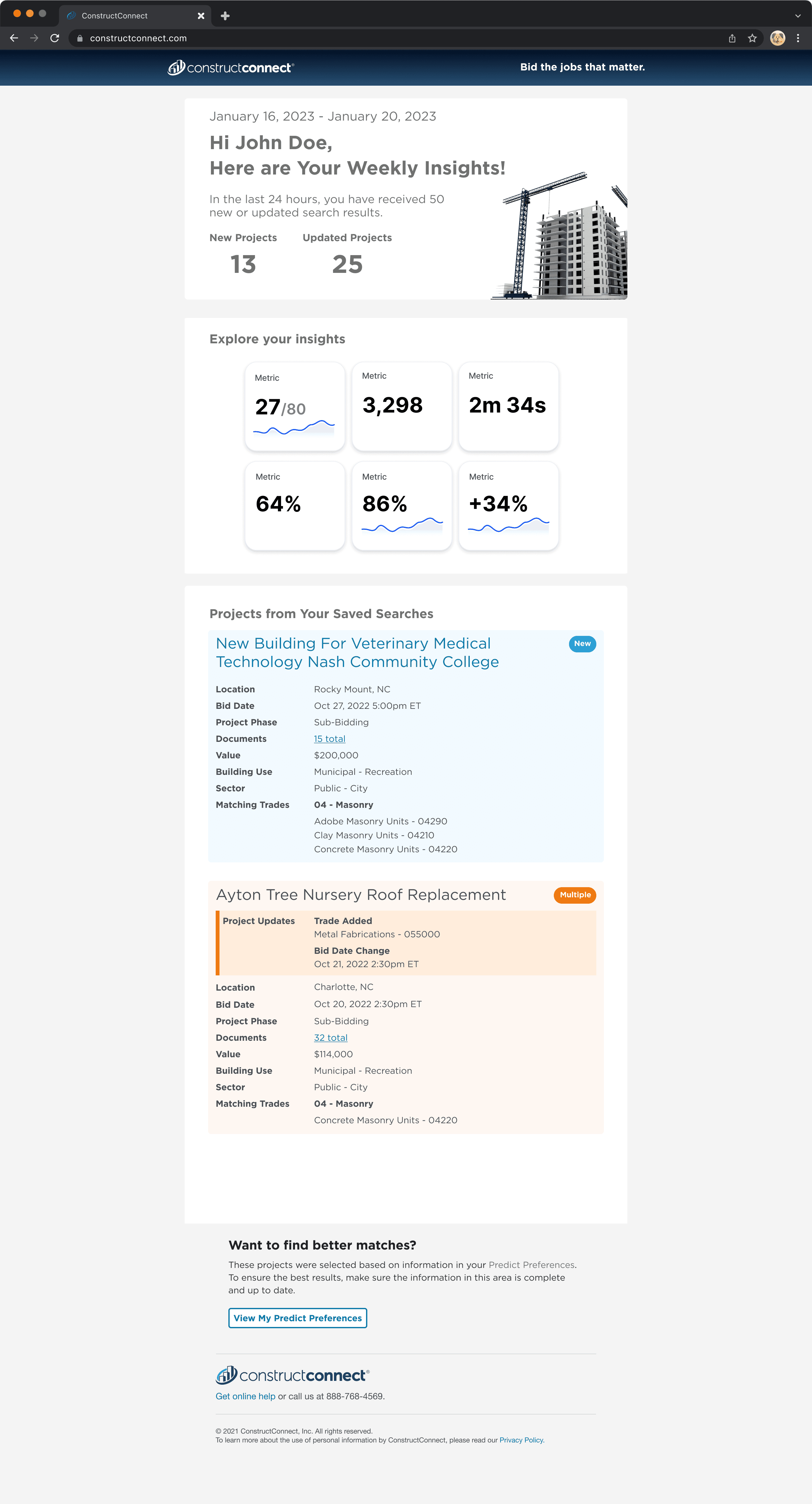
The team identified a gap in user engagement: many subscribers weren’t logging into the platform daily, causing missed opportunities and lower conversion rates.
To address this, I designed a Daily Leads Email, giving users a quick snapshot of new and updated projects tailored to their saved searches, with clear paths back into the platform.
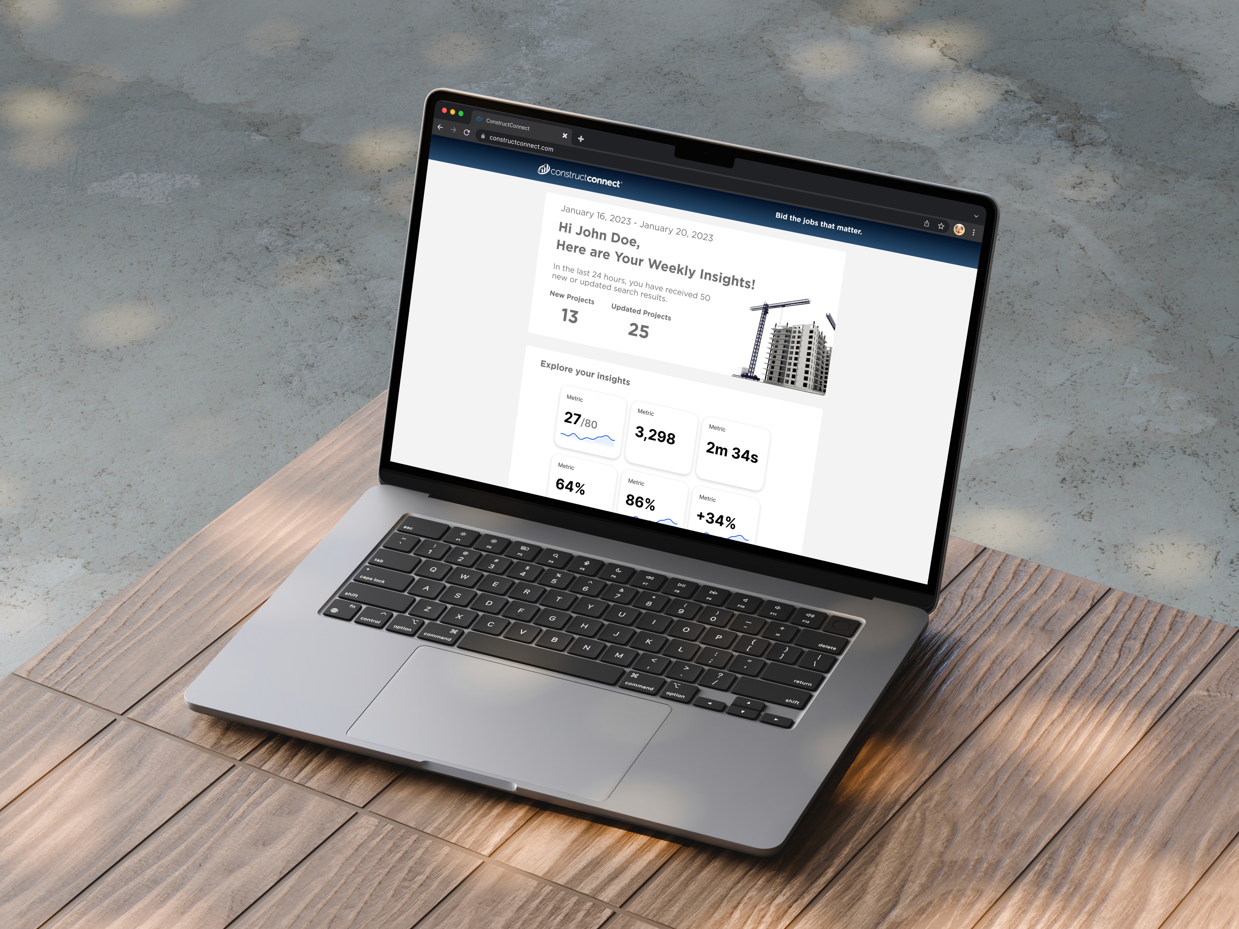
The goal was to transform a simple email notification into a meaningful daily touchpoint between users and the ConstructConnect platform.
I set out to design a visually engaging and easy-to-scan email that would deliver personalized project insights directly to each user’s inbox, helping them stay informed about new and updated opportunities without needing to log in.
By creating a clear, data-driven summary with intuitive calls to action, the Daily Leads Email aimed to re-engage users, drive traffic back to the site, and strengthen their ongoing connection with the product.