about.
Photography has always been about more than capturing a moment. It's the anticipation, the ritual, and the stories that unfold when we finally see what was caught on film.
Flashback set out to bring that magic into the digital age: users shoot "blind," photos stay hidden, and only after a roll is "developed" can they relive their memories.
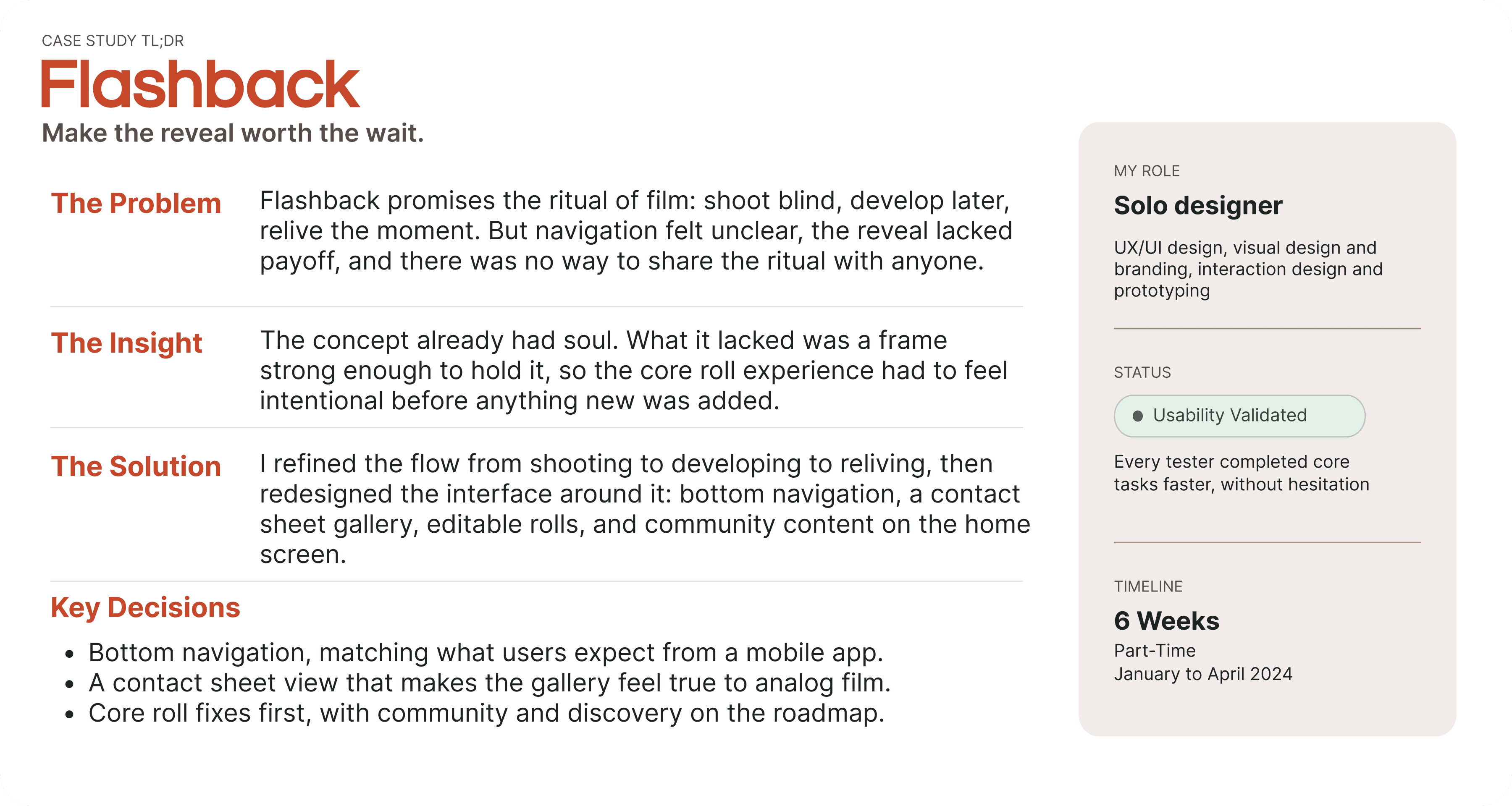
But as I explored the app, I noticed a gap between that promise and the experience of actually using it. The soul of film was there. What it needed was a frame strong enough to let it shine, which raised the question at the center of this project:
problem statement.
How might we help Flashback deliver on its promise — reviving the anticipation and storytelling of analog photography — through an experience that feels as intentional as the concept behind it?
Flashback's premise is compelling: shoot blind, develop later, relive the moment. But early testing and use revealed a gap between that promise and the day-to-day experience — navigation felt unclear, the reveal moment lacked payoff, and there was no built-in way for the ritual to feel shared or communal. The concept had soul; the execution needed a frame strong enough to hold it.
My approach was to:
Refine the core film roll experience, smoothing the gallery, development, and sharing flow so the ritual feels seamless.
Expand the concept with new features like collaborative rolls, community challenges, and time-capsule modes that deepen delight and connection.
Redesign the interface itself, applying UX/UI principles to make the app more intuitive, accessible, and visually cohesive.

research.
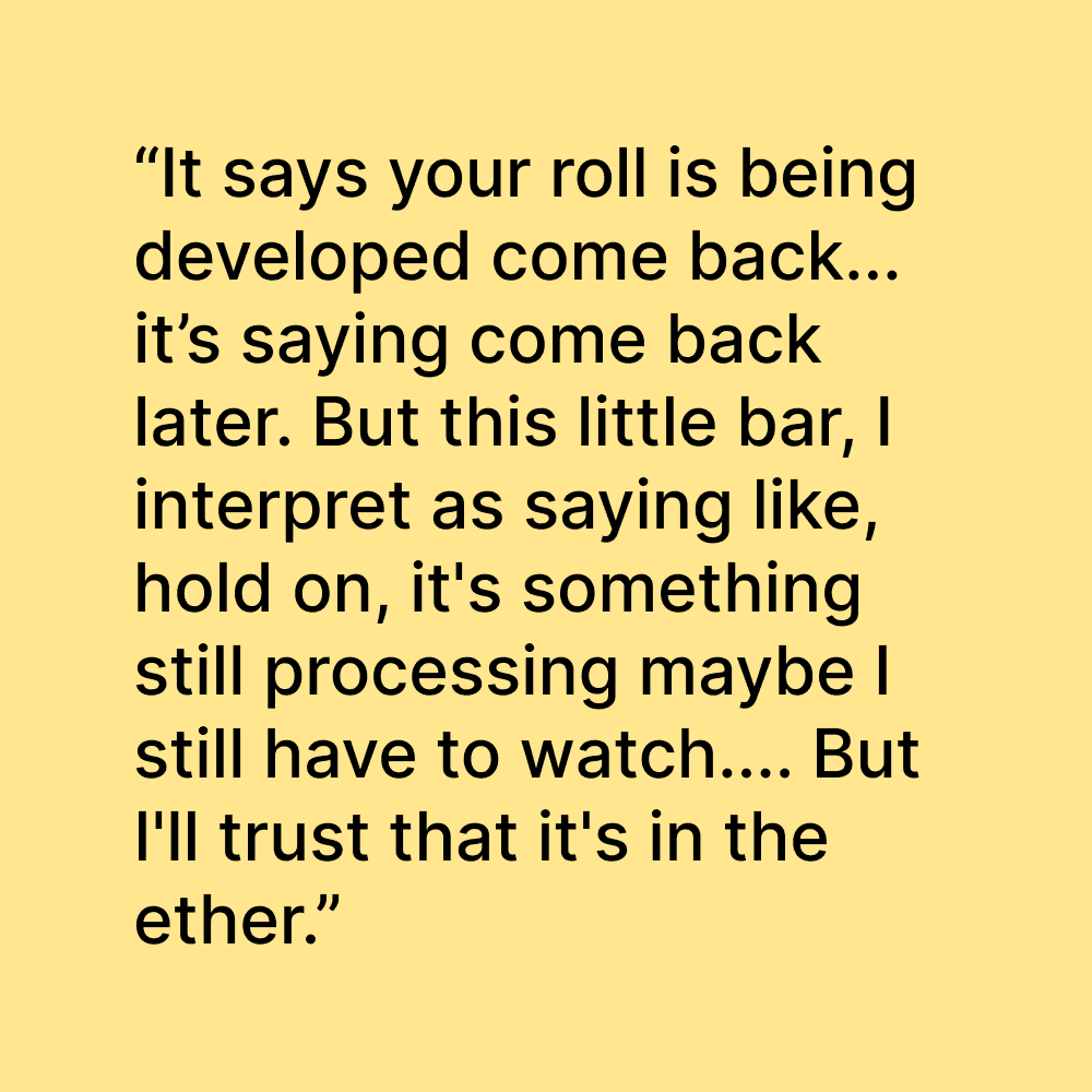
I began by reviewing Flashback's app alongside its brand promise: "The soul of film, reborn." When I first downloaded it, I approached the experience as both a designer and a curious new user, mapping the actual flow from shooting a photo, to "developing" a roll, to viewing the gallery.


result.
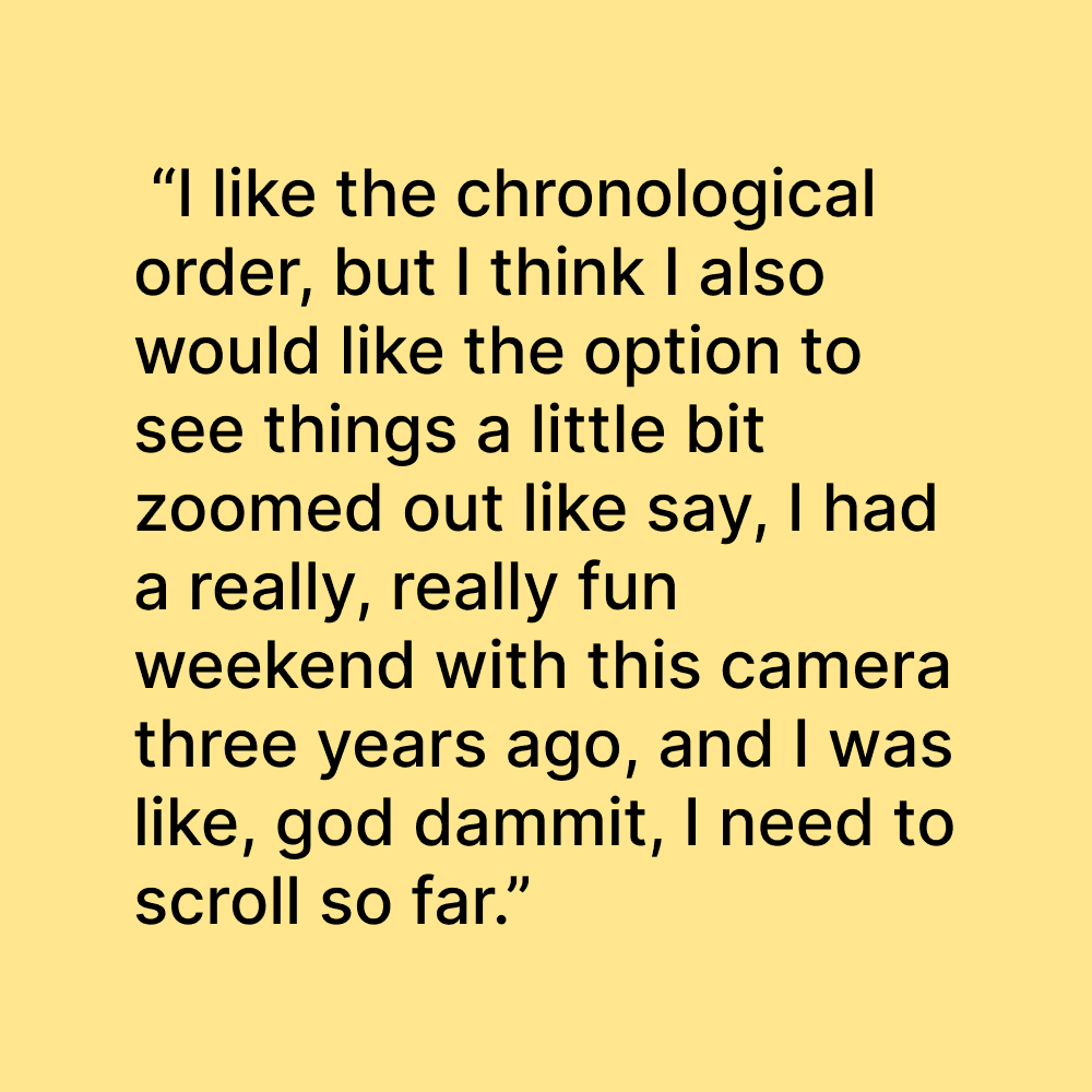
Through interviews and research, I identified what users valued most: the features they couldn't imagine the app without, and the ones they were most excited to see next.
MVP Features
The essential features and flows that close the gap between Flashback's promise and its current experience, prioritized because they directly address the clarity and usability issues uncovered in research.
Core Roll Experience
Contact Sheet View
Improved Navigation
Editable Roll Title/Image Names
Roll Journal/Notes
Favorites
Download Individual Photos and Rolls
Future Roadmap
Conceptual features that expand Flashback's world once the core experience is solid, opportunities to deepen storytelling, strengthen community, and invite exploration.
Storytelling & Delight
Flashback Moment (memory resurfacing)
Widget (showcase photos on home screen)
Roll Stats/Analytics
Photo Editing (stickers, drawing, doodles)
Community Growth
Roll of the Week (spotlight feature)
Curated Collections (editorial + curated galleries)
Badges (milestones, challenges, group rolls)
Exploration & Discovery
Map View
Random Film Stock (roulette for creative play)
Film Shop (unlock/purchase new digital films)
before & after UI redesign.
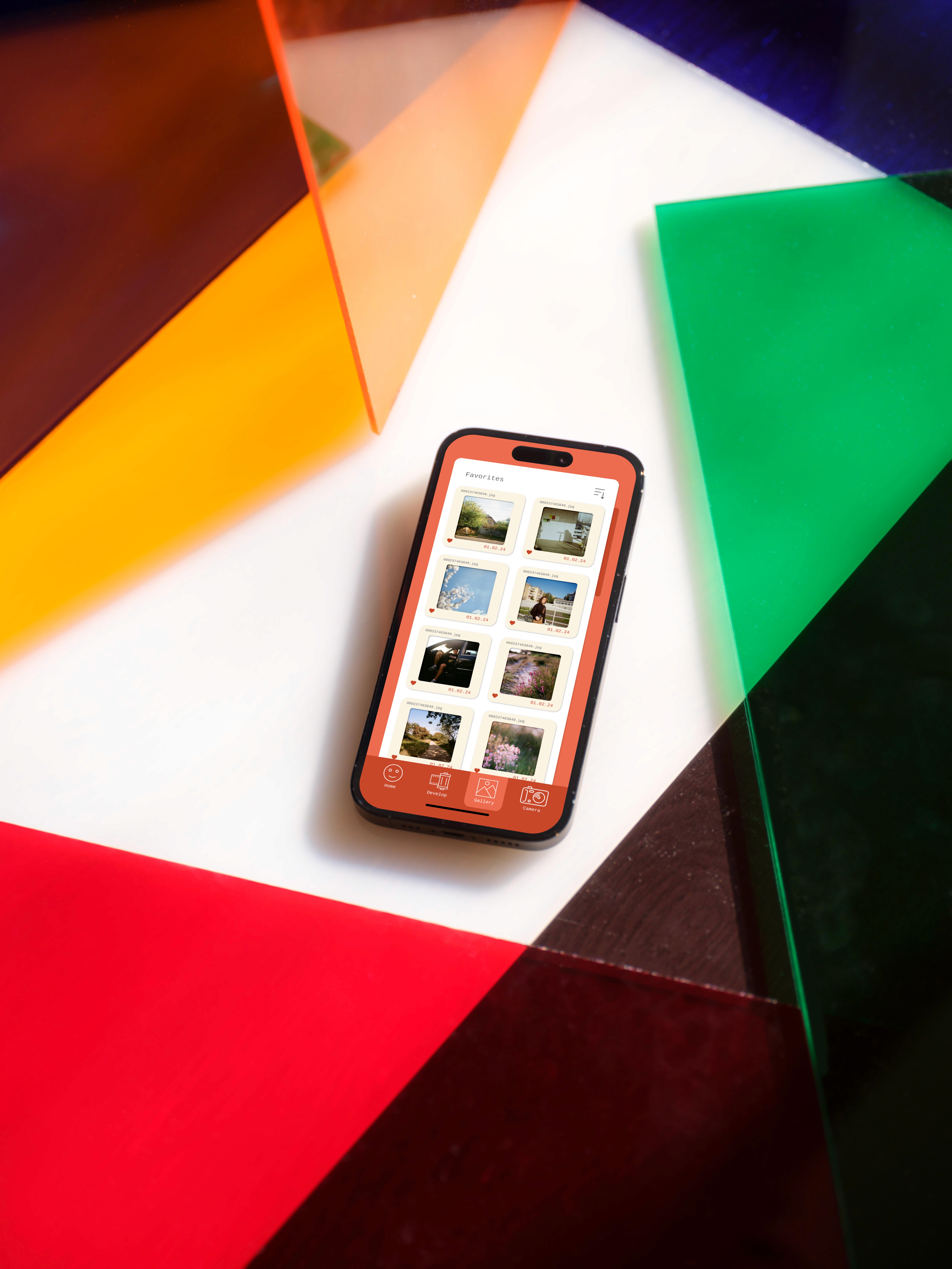
Each change below traces back to a specific pain point from research. From reorganizing visual hierarchy and navigation, to introducing a contact sheet view and community-driven content on the home screen, every shift was designed to make the experience feel clearer and more immersive.
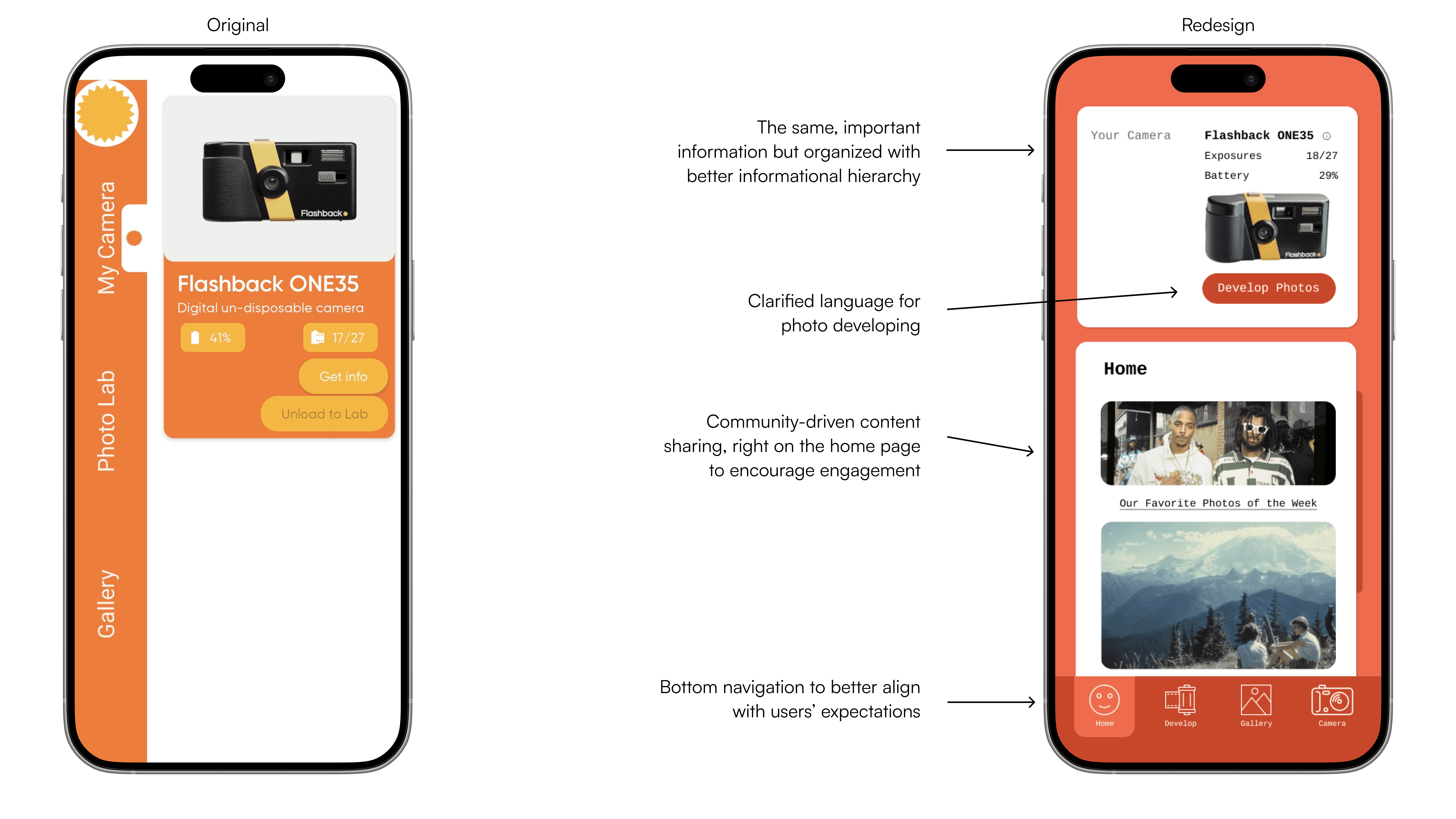
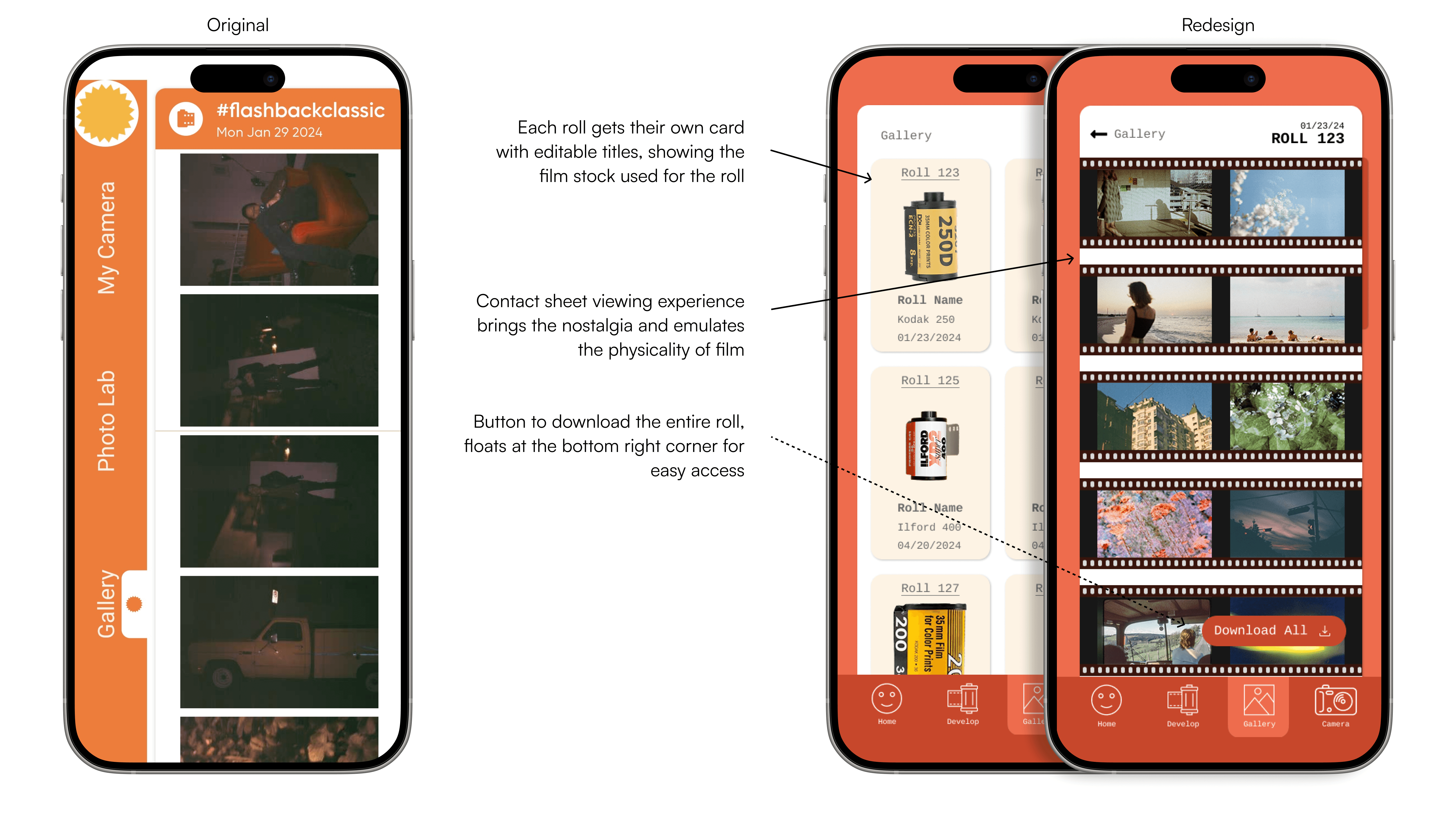
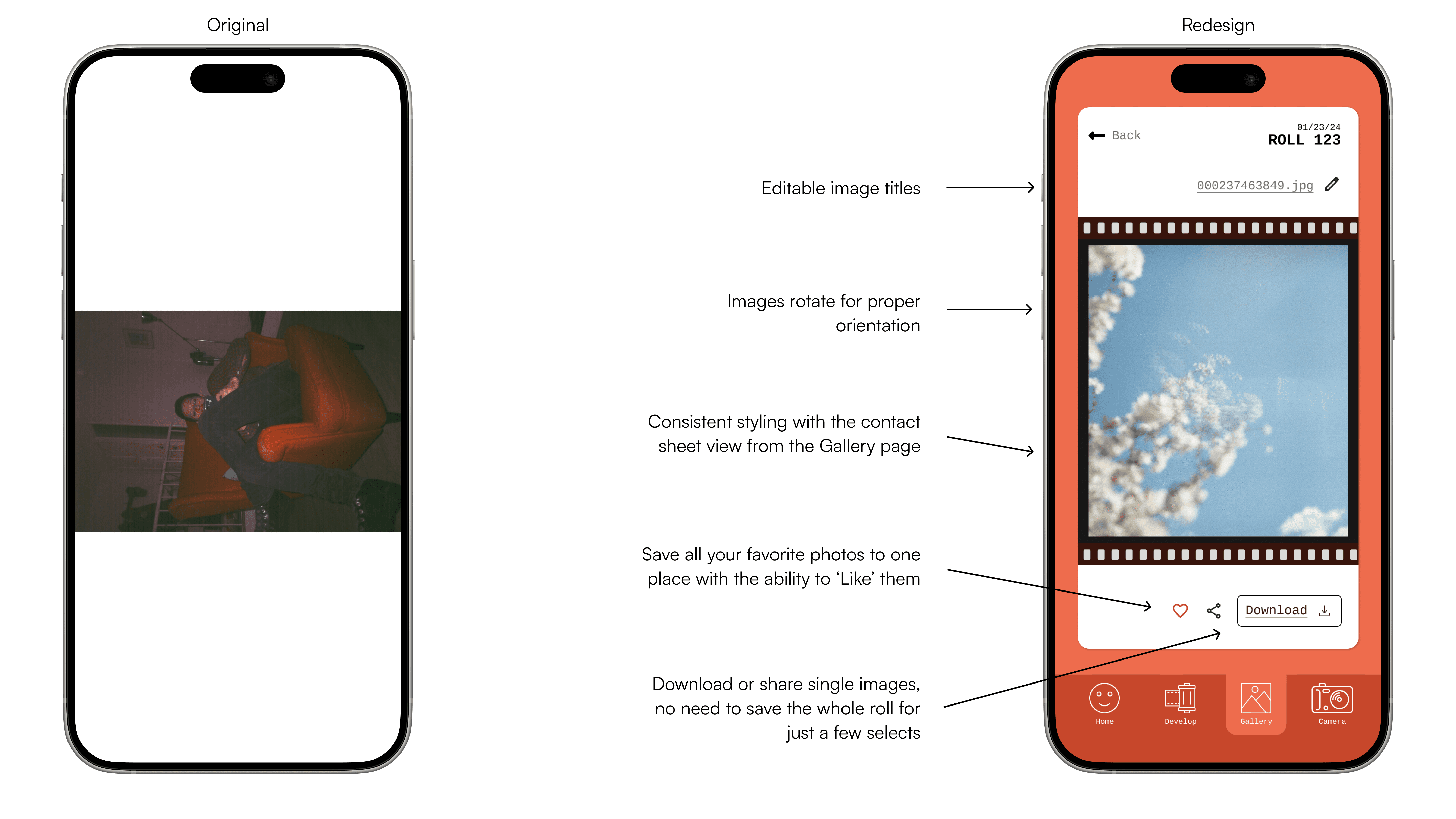
Together, these changes shift Flashback from an app that simply delays photo reveals to one that makes the entire ritual, shooting, developing, and reliving, feel intentional, clear, and worth coming back to.
validation.
To confirm the redesign actually solved the problems uncovered in research, I tested the updated screens with users and asked them to complete three core tasks: downloading a photo, unloading a roll, and renaming a roll.
The response was clear. Every user completed the tasks faster and without hesitation, a shift from the confusion and "hmm" moments observed in the original research. Moving navigation to the bottom of the screen was the most consistently praised change, aligning with what users expected from a mobile app. The contact sheet view was called out specifically for how delightful it felt, several users said it made the experience feel more true to analog film than the original design did. Beyond usability, users responded to the added social element, saying it gave them a reason to keep coming back to the app.
Taken together, this testing confirmed the redesign closed the gap identified in the original problem statement: users no longer needed to search for clarity, and the experience felt both more usable and more emotionally resonant.