
about.
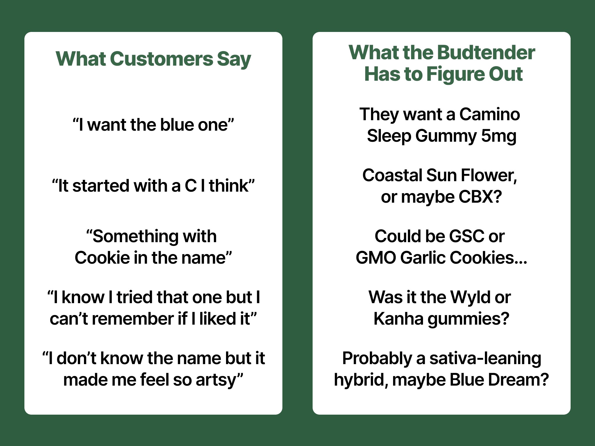
I work at Sweet Flower, a cannabis retailer, and I kept seeing the same thing at the counter: someone wants to buy again — a strain they loved, an edible that actually worked for their sleep — and they just can't remember what it was.
That's not a discovery problem. Budtenders solve discovery in 30 seconds. It's a memory problem. Cannabis products don't have the packaging permanence or brand loyalty other categories rely on. Strains rotate, brands rebrand, batches vary, and there's no single source of truth a customer carries between visits.
So the real gap isn't "help people find weed" — it's "help people remember what already worked."
problem statement.
That reframe — memory, not discovery — became the lens for everything that followed. Here's how I distilled it into a problem I could design around:
How might we make it effortless for customers to recall products they loved, without turning tracking into a chore?
research.
No formal study — just months of real counter conversations, informally tracked. The pattern: customers were fluent in sensation and context (how it made them feel, when they got it, what it looked like) but almost never fluent in the actual product identifier (name, brand, batch). Consistent enough across dozens of interactions to be a real, addressable problem, not a one-off complaint.
This ruled out a discovery fix (budtenders already solve that) and a loyalty fix (many were repeat, satisfied customers). It was a recall problem — which is what pointed the design thesis toward "recall over logging" rather than a recommendation engine or rewards program.
process.
Choosing the core loop
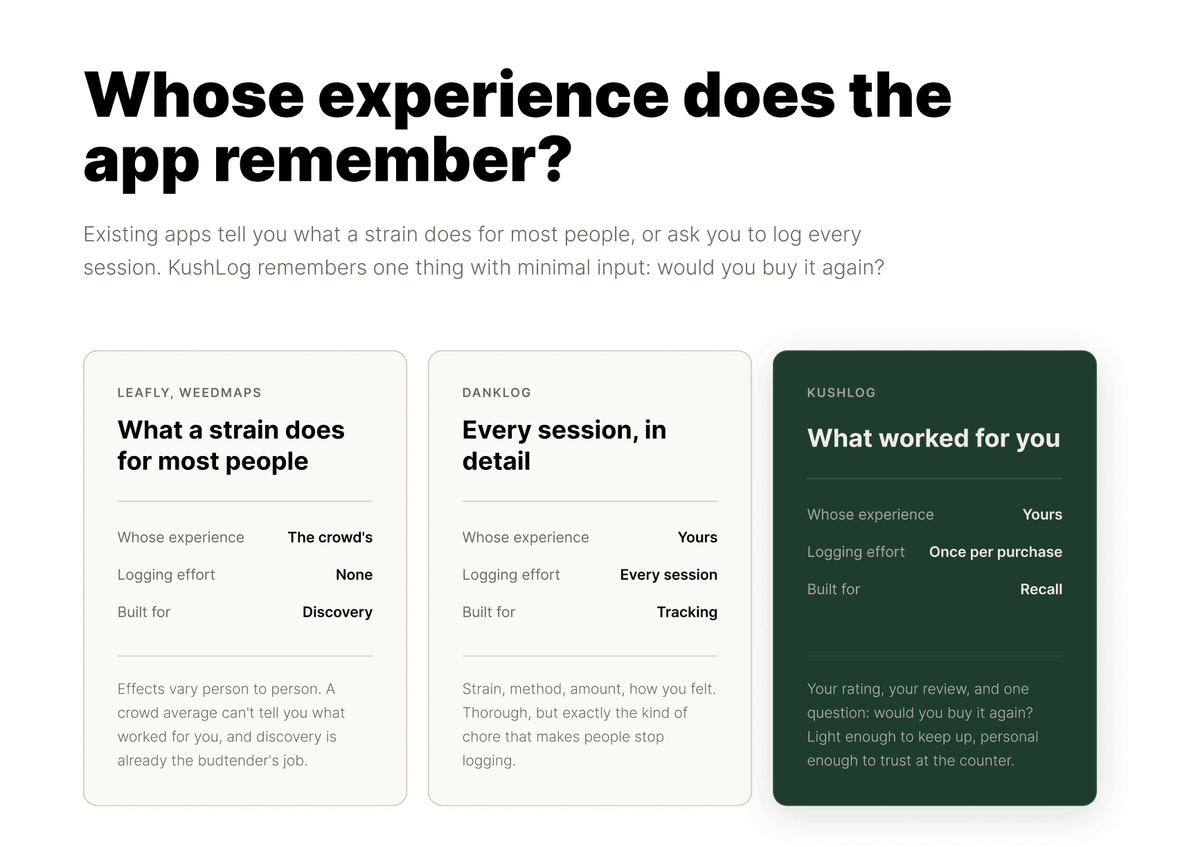
Before designing anything, I looked at what cannabis apps already do. Leafly and Weedmaps are built around strain information and finding dispensaries: what a strain is supposed to do, based on what most people report. That's useful for discovery, but effects vary a lot from person to person. A crowd average can't tell you how a product worked for you, and discovery is already the job budtenders handle well.
DankLog came closest to a personal record, but it's built around logging every session in detail: strain, method, amount, how you felt. That's thorough, and it's exactly the kind of chore that makes people stop logging.
So I left out strain databases and crowd-sourced effects entirely. KushLog stores one thing the other apps can't: your own reaction. Did you like it, and would you buy it again? The core loop follows from that. Log a purchase quickly, find it later by feel or category, then confirm on the detail screen before buying again.
Building a design system
Before touching individual screens, I defined tokens and component specs so every screen pulled from one source. Most of those choices serve one moment: someone scanning their history at the counter.
Gold is reserved for actions and ratings. If it's gold, it's either something to tap or a signal of what worked. Sage Mist is the background because it's a calm canvas that lets product photos lead, and my research showed people remember what a product looked like long before they remember its name. On purchase cards, ratings show as a numeral with one star ("5 ★") instead of a row of five, because it reads faster at card size.
For type, I wanted the app to feel like something you'd want to open, not a form you have to fill out. Climate Crisis is reserved for the wordmark because its heavy, chunky letterforms are punchy and distinctive while staying easy to read. Tilt Warp handles headings because it feels welcoming while still looking stylish. Poppins handles body text because it stays readable at small sizes and still feels fun and comfortable. Together, the three read as one voice at three volumes: loud for the brand, friendly for the structure, easy for everything you actually read.
Writing the specs up front also gave me a shared vocabulary for every Figma Make prompt, which made the output predictable.


Narrowing and refining
Once the core loop and design system were set, the work became narrowing each screen down to what recall actually needs. One customer shaped the most important decision.
They came to the store with a list of past purchases in their phone's notes app. There was no organization to it at all, but under a picture of every item was the one thing they had made sure to write down: whether they would buy it again. So I made "Would you buy this again?" a simple Yes/No on every purchase. It captures the single most useful thing a customer can know about a product, and one tap is fast enough that people will actually answer it.
The same customer explains what My Purchases shows first. A list sorted by date treats your history like a log. I made Buy Again the default filter, so opening the app does what that notes list was trying to do: show you what worked.
I iterated and edited in Figma Make one component at a time, using Claude to sharpen each prompt first: name exactly what should change and what shouldn't. That kept every iteration moving forward instead of re-fixing collateral changes from the last one, and I checked each output against the thesis before moving on.
Illustration system
Onboarding is the only place the app has to sell a feeling before it has any of your data. Once you've logged purchases, your own product photos become the visuals, so illustrations live only there.
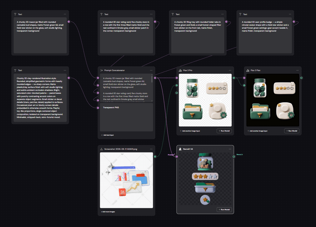
I chose custom illustrations over stock so the app would feel ownable and distinct from the competitors I'd studied. I have a fine arts background and could have drawn the set by hand, but I deliberately chose a workflow I hadn't used before, both to move fast and to push myself into a new tool. I went with a soft 3D clay style because it's playful and tactile, the same fun, comfortable tone Tilt Warp and Poppins set in the type.
I generated the set with Flux 2 Pro through Figma Weave, using the Prompt Concatenator tool to batch every asset in one pass instead of generating them one at a time. This enabled me to keep lighting, material, and color consistent across the whole set.


How I worked
I used AI where it made me faster and kept the judgment calls for myself. Figma Make let me explore layouts quickly and iterate one component at a time. Claude helped me define the design system specs up front and sharpen every Figma Make prompt before I ran it, so each change landed where I intended without breaking something else. Flux 2 Pro through Figma Weave generated the onboarding illustrations, a workflow I picked up specifically for this project.
What the tools didn't do was decide anything. The observation at the counter, the recall-over-logging thesis, the competitive read, and every call on what to keep, cut, and change were mine. AI shortened the distance between an idea and something I could evaluate, which meant more time spent on the evaluating.
screen by screen walkthrough.
Guest View
"Let me see if this is worth my time"
Before anyone signs up, they can explore KushLog in guest mode with example purchases already populated. The job here isn't "collect an email," it's "prove the value before asking for commitment."
A banner makes clear this is a demo, and the sign-up prompt stays present but not pushy, so someone can genuinely evaluate the recall experience (filter chips, ratings, buy-again tags) before deciding to create an account.

My Purchases
"Help me find what I’m looking for, fast"
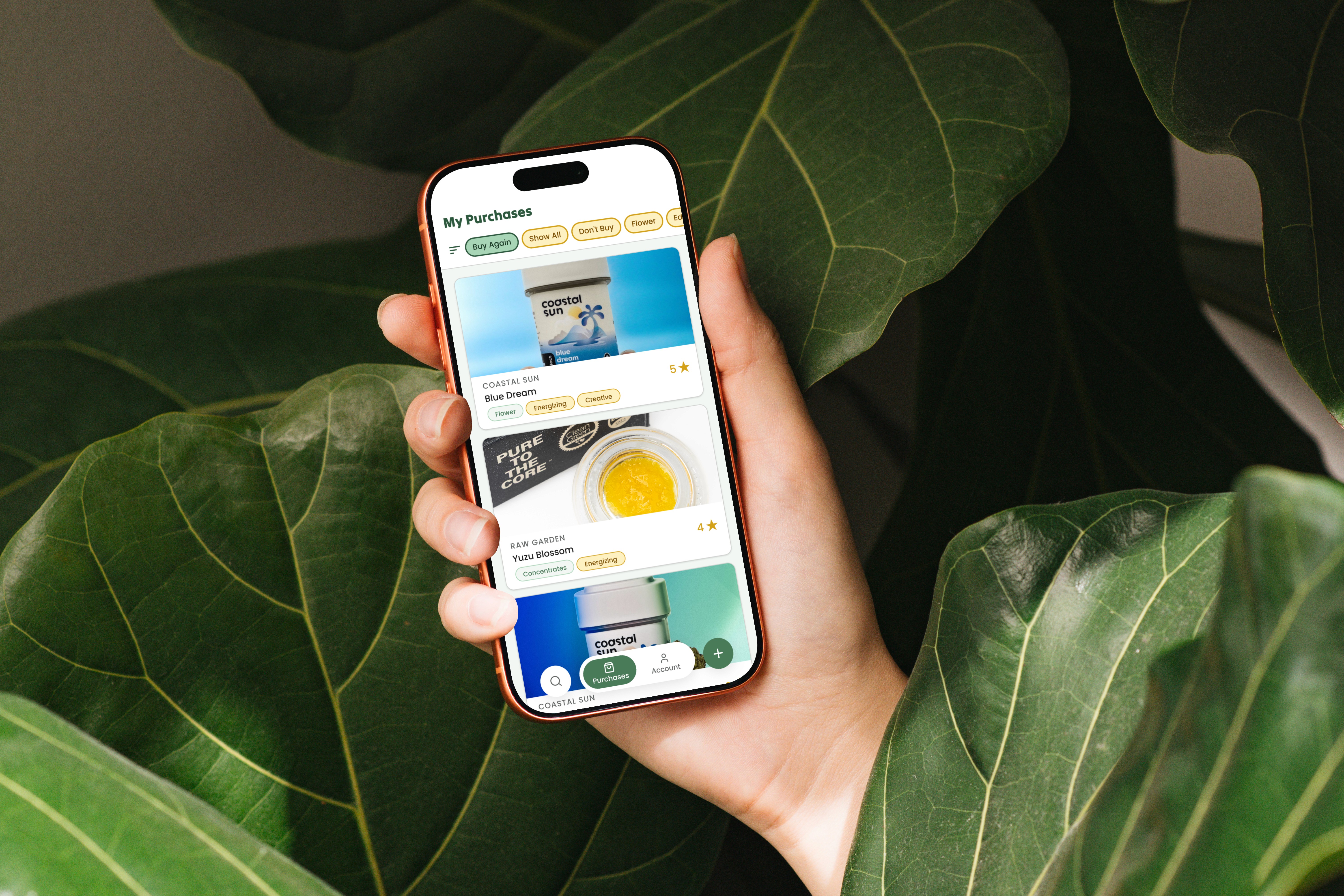
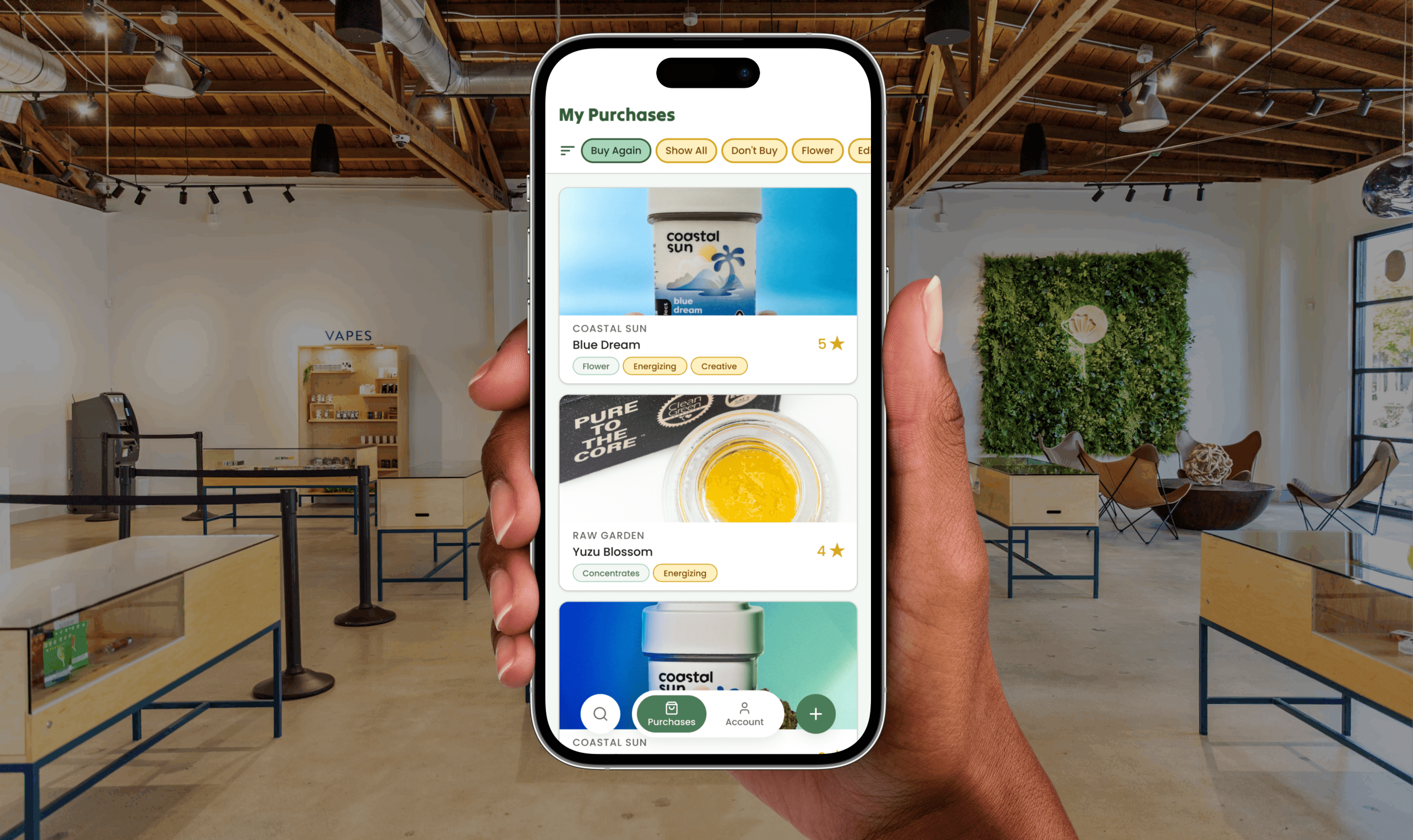
This is the home screen and the core of the recall loop. Filter chips (Buy Again, Show All, category types) sit right under the header so someone can narrow by exactly the kind of question they walk in with, not "search the whole list."
Each card leads with the product image and name, then surfaces the two things that matter most at a glance: category and star rating. The design bet here is that most recall moments are fast and low-effort. You're not sitting down to read reviews, you're scanning for "was it that one" in a few seconds.

Search
"I’m looking for something specific, help me get there"
A focused search modal layered over My Purchases, searchable by name, category, or review text. This exists for the minority of moments where someone has a specific, confident memory ("I know it had cookie in the name") rather than a browsing mindset. Keeping it as an overlay rather than a separate screen means it doesn't interrupt the primary browsing flow, it's there when needed and gone when it's not.

Add Purchase
"Let me log this without it feeling like a chore"
This is the screen most in tension with the app's own thesis, since logging is the cost, not the payoff. The form covers what's actually useful for future recall (name, image, category, rating, review, buy-again yes/no) without asking for anything extraneous. The rating input is visual and immediate (tap the stars), and the buy-again question is a simple binary rather than an open-ended field, since that single yes/no is often the single most useful thing to remember later.


Scan to Log
"Don’t make me type more than I have to"
Every dispensary product ships with a QR code required for compliance tracking, and it links to product and lab data that can pre-fill the entries someone would otherwise have to type in by hand: strain, brand, etc. Rather than treating the Add Purchase form as something the user fills out from memory, this screen lets them scan the product itself and auto-populate the entry. A manual entry fallback stays available for edge cases (damaged QR codes, older packaging), but scanning is the default path.
This screen exists because friction is the real enemy of the app's core thesis. Every field someone has to type by hand is a chance they skip logging entirely, which means the recall moment down the line never happens because the purchase was never captured in the first place. Cutting logging down to "scan, rate, done" is a direct bet that lower friction means higher retention: an app that's easy to log into today is the only kind of app that has anything useful to recall from six months from now.

Product Detail
"Remind me what I actually thought"
This is where the payoff of logging finally shows up. Product image, star rating, the full written review, and a clear buy-again answer, all visible without scrolling on a single screen. The job here isn't discovery, it's confirmation: you already suspect this is the one, this screen exists to confirm it fast and tell you whether it's worth buying again.

My Account
"Give me the words to describe what I need"
Consumption preferences live here, condensed into a single scrollable profile rather than spread across multiple settings screens. The job isn't just app personalization, it's arming someone with language they can actually use at the counter. Instead of a customer vaguely saying "something relaxing, I guess," this screen gets them to a concrete, remembered vocabulary: preferred method, how often they consume, and which effects they're chasing, so they can walk in and describe what they need instead of hoping the budtender guesses right.

testing plan & next steps.
The prototype is built, but it hasn't been in front of real users yet. Here's what comes next.
What I want to test
Does filtering by category, rating, and buy-again status actually beat trying to remember a product name cold?
Does logging a purchase feel quick, or does it feel like a chore? If it's the latter, that's a direct hit against the recall-over-logging thesis.
Does the My Account screen actually help someone describe what they want at the counter, not just personalize the app?
How I plan to test
Small sessions with real customers. Realistic tasks (log a purchase, find a past one by feel or category rather than name) plus a debrief on whether the My Account framing holds up.
Whatever I learn gets folded back into the design before I call this final. This section will get updated with real findings rather than presenting untested assumptions as validated decisions.
Near-term roadmap
Drag-and-drop chip ordering on My Purchases
A dedicated Favorites filter, separate from Buy Again
Filter/browse by effect
A functional build in React Native/Expo
Domain and trademark search before going further