about.
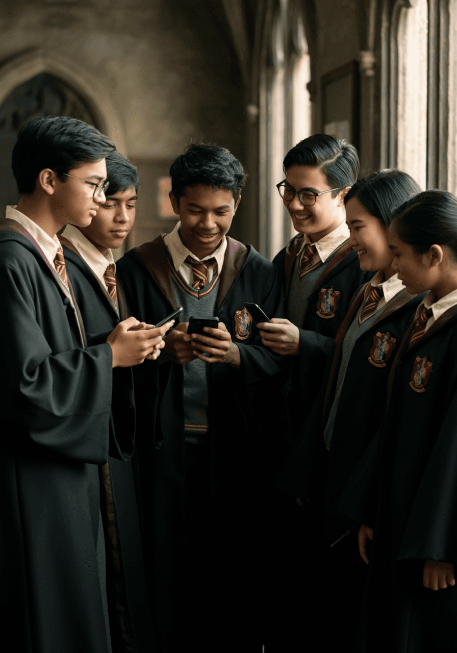
As a lifelong Harry Potter fan, I couldn't stop imagining what Hogwarts would look like if it entered the digital age, and what a school built on magic would actually need from a modern app.
This concept project was a self-directed exploration of that idea: designing a mobile app for a Hogwarts student that manages the real logistics of school life, classes, homework, house points, and owl post, without breaking the immersion of the wizarding world.
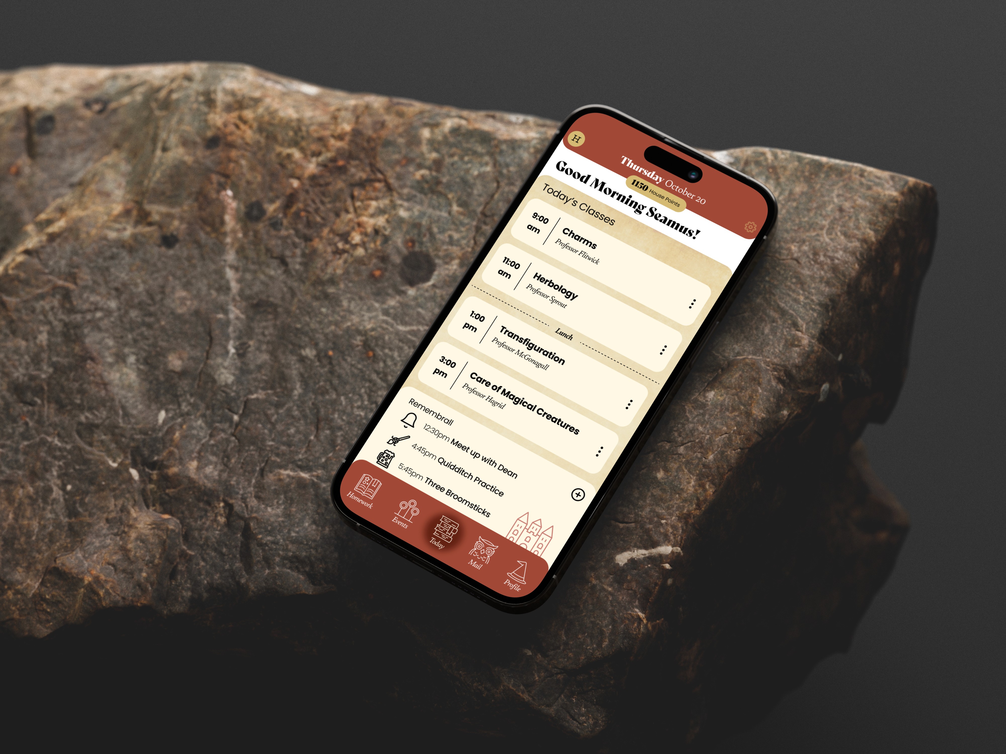
The result is an app concept that feels like it belongs inside the Wizarding World: five core tools for a student's daily life, built on a visual system as considered as the story it lives in.
problem statement.
How might we help a Hogwarts student manage the real logistics of school life without breaking the spell of the wizarding world?
My approach was to:
Turn iconic wizarding textures, parchment, wax seals, house crests, into functional UI surfaces (cards, buttons, navigation) rather than decorative skins on top of a generic app
Anchor the day around one real-time schedule view instead of a static timetable, so a student always knows what's happening next without cross-referencing multiple screens
Make House Points a live, visible leaderboard and Owl Post a familiar messaging pattern, so competition and connection happen inside the fiction rather than as bolted-on push notifications
research.
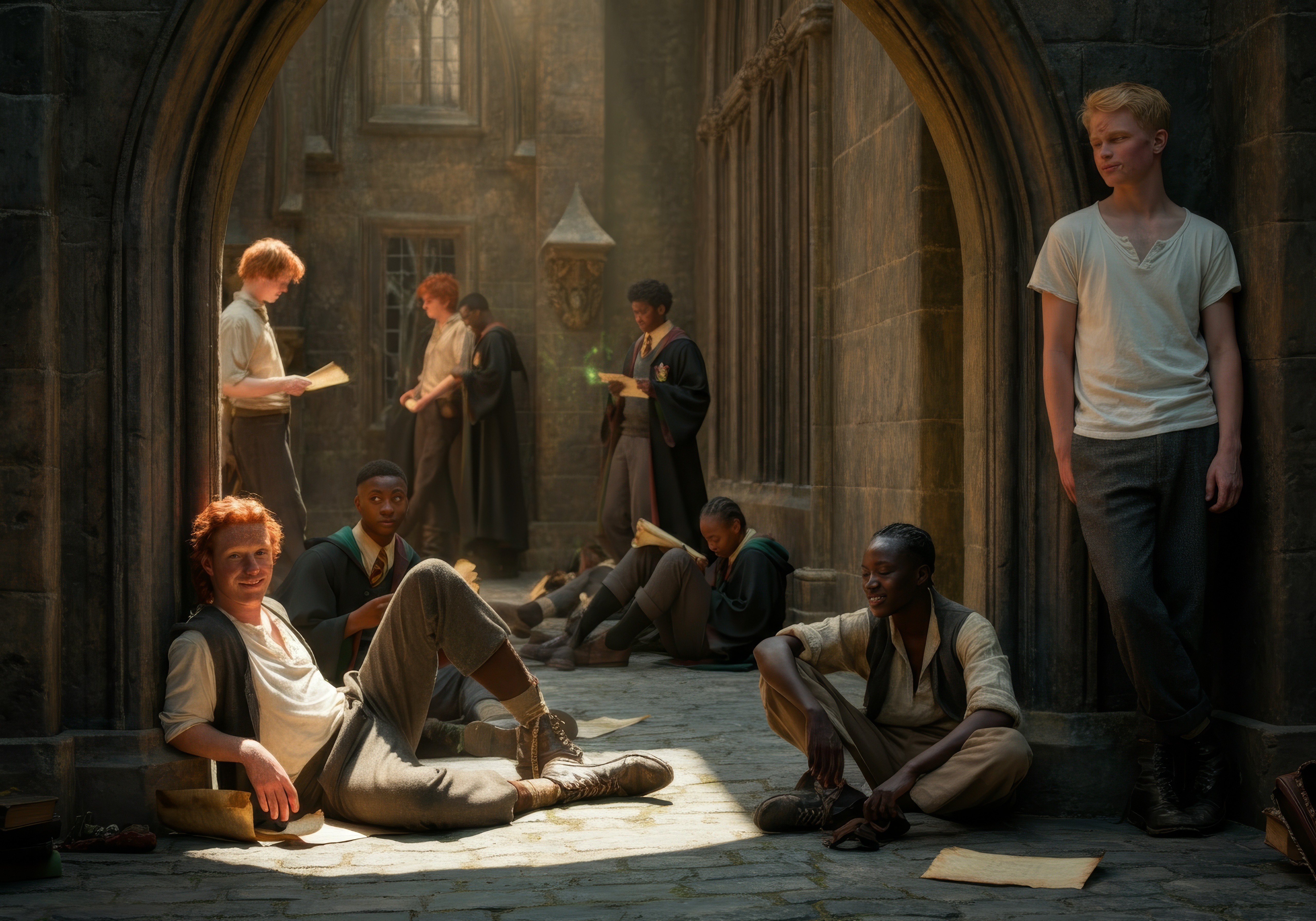
Before diving into design, I split my research into two tracks: the Muggle world and the Wizarding World.
On the Muggle side, I studied educational and gamified apps like Duolingo, ClassDojo, and Notion to see how modern students track progress and stay motivated.
On the Wizarding World side, I sifted through fan-made apps, wikis, and official Harry Potter content for the visual and thematic details fans love most — house colors, Remembralls, parchment textures, floating candles.
Two things stood out: gamified apps succeed through small, satisfying rituals, not flashy visuals, while Wizarding World media is rich in sensory detail but has almost no precedent for things like notifications or navigation. That gap became my brief — borrow the ritual-and-reward mechanics from ed-tech, then translate Wizarding World details into familiar interface metaphors: parchment as a card, owls as a notification, house colors as wayfinding.
Four research threads shaped the icon toolkit, shown below: academics, Quidditch games and other events, Owl Post messaging, and the house system.

result.
Each of Eloise's frustrations mapped to a specific design decision.
Her fear of losing homework scrolls in the common room drove the Homework tab's due-date and progress-indicator system. Her worry about missing dates shaped Today's Schedule as a single real-time source of truth instead of a static timetable. And her wish to feel connected to her housemates is why House Points became a live, social leaderboard rather than a private stat screen.
These insights shaped the foundation for the app’s structure and helped me design the core features with both utility and enchantment in mind.
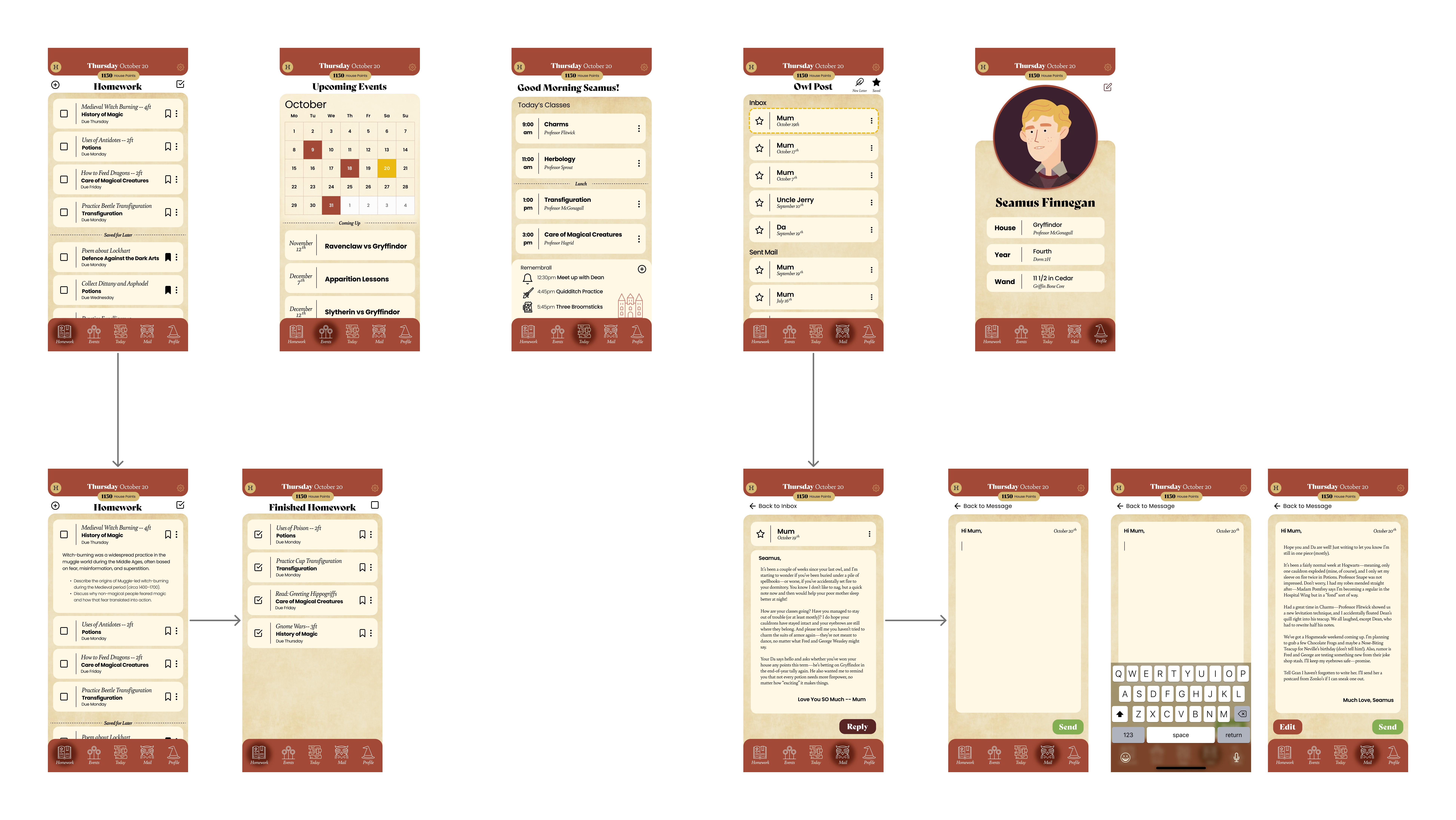
I created user flows and wireframes centered around five key sections:
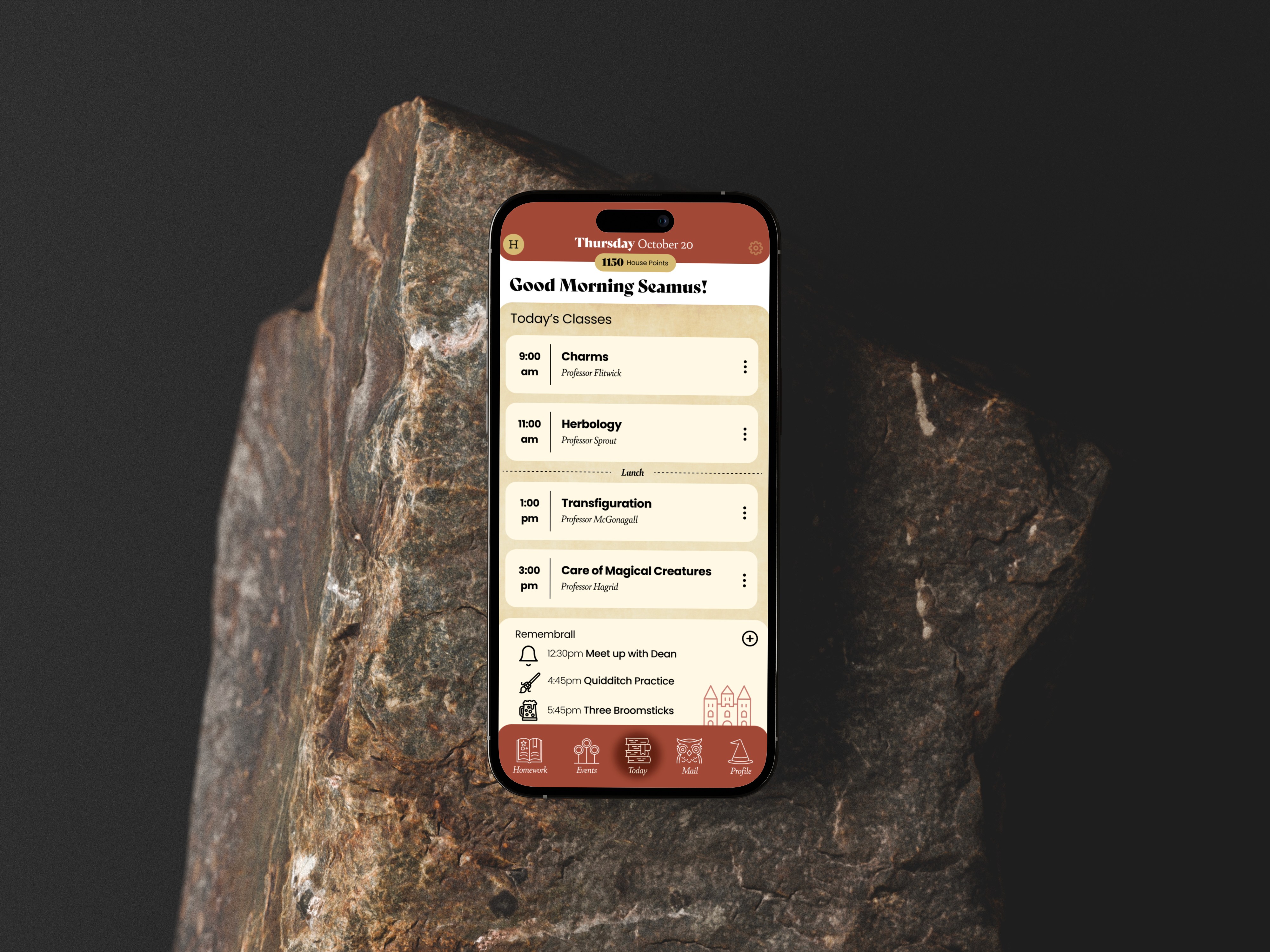
Today’s Schedule – A home screen that provides a daily overview of classes, events, and tasks, styled like a magical timetable that updates in real time.
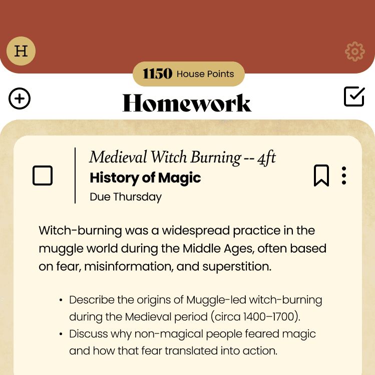
Homework – A task tracker with cards for each assignment, complete with due dates, progress indicators, and optional magical reminders (like a howler!).
Events – A calendar of school-wide happenings, from Quidditch matches to potions workshops, with RSVP and notification features.
House Points – A live leaderboard and personal contributions tracker, encouraging positive behavior and friendly competition between houses.
Owl Post – A whimsical messaging center styled like parchment mail delivered by owls, with custom stamps and animated “deliveries.”





This project let me practice designing inside someone else's IP: building new interaction patterns, like Owl Post and House Points, that had to feel inevitable within an established fictional world rather than invented from scratch.
If I were to take it further, I'd want to validate two tensions with real students: whether the House Points leaderboard actually motivates positive behavior or just adds social pressure, and whether owl-styled notifications read as delightful or slow someone down who's just trying to check tonight's homework. Those are the exact trade-offs between delight and usability I look for in any design problem, fictional world or not.